Responsive Design — What's coming in 2018 and beyond
Hello amazing Adobe Max attendees! I promised you all a list of examples and codepens and they are certainly in the process of going up on this site.
I ended up attending more sessions at Max than I was anticipating and as a result I haven't finished this page just yet (but I'm super inspired to do more things now). Rather than have you wait a little bit longer for the web page I wanted to get a hold of you now and let you know that if you want to download the presentation ahead of this page being ready you can.
The first link are the slides that I presented to you on Wednesday, and the second link are both the slides presented, the presenter notes, and all the slides that didn't make the final cut.
Please remember these are LARGE files! I mean, they're smaller than visiting the Adobe Max site, but they're still pretty big.
Download RWD 2018 Presentation (PDF) with all the extras & speaker notes — 14MB
Download the RWD 2018 Presentation (PDF) — 36.7MB
I'm jumping on a plane now and will work on updating the rest of this page as I fly and tomorrow, I'll be in touch again once it's finished.
Thank you so much for attending the talk, I hope you managed to learn one or two things from the session, and if you have any follow up questions be sure to reach out to me at justin@responsivedesign.is
My name is Justin and I manage and curate the RWD Weekly newsletter, Podcast and maintain a resource site about responsive web design.
Today I want to talk to you about what you need to be thinking about and practicing when approaching your responsive design projects now and in 2018.
The web moves at such a fast pace, it can be difficult to keep up with the constantly growing number of devices, screens, inputs, and Internet users around the globe. It also means that the things I used to outline my talk in April aren't necessarily the things that I'm interested in telling you in October.... so I'm going to talk about everything I was going to and sprinkle six months worth of the web through it as well.
Contents
The contents of this talk is split into four distinct areas. Each one can be consumed on it's own, however I think you'll be a lot more prepared for buildng sites the right way in 2018 if you follow them one at a time.
- Use CSS Grid to build in browser wireframes and break the traditional mould of web design
- Make your website faster without scrimping on design and functionality
- Progressively enhance and go from website to progressive web app with offline support
- Handle more than just the keyboard and mouse - effective ways to deal with the new wave of input methods - and more specifically a range of new out put methods.
CSS Grid Layout
If you haven’t already joined the Grid and Flexbox band wagon then now it’s time because Flex is already here and Grid is galloping up behind it and we should start seeing it hit browsers next year.
Floats
Before we get into Flex and Grid though, lets take a look back at where we came from. ALL HAIL THE MIGHTY FLOAT.
The main problem with floats is that they were never designed for laying out the structure of our website. Someone found way that we could use them to allow for this.... but it never was the intension.
Floats were created to do two fundamentally basic things, very similar to each other. Float an image to the left. and, float an image to the right.
Then we move into the real world and add real words to the mix and end up with this. Some are really really long and others are really really short. After many years of using floats for layout we were given a shimmer of hope...
See the Pen Float Grid with Content by Justin Avery (@justincavery) on CodePen.
Flexbox Layout — a 1 dimensional layout
Flex box is a one dimensional layout that provided us with the ability to start stepping away from floats. When you apply flex box to a container you tell it to go along the x axis or the y axis.
<div class="container">
    <div class="item"></div>
    <div class="item"></div>
    <div class="item"></div>
</div>
.container {
    width: 95%;
    max-width: 1024px;
    margin: 1em auto;
    display: flex;
    flex-wrap: wrap;
}
.item {
padding: 1em;
margin: 1%;
flex-basis: 15em; /* be 15em wide */
flex-grow: 1; /* Grow full width */
flex-shrink:0; /* Don’t shrink. */
}See the Pen Flexbox Grid with Content by Justin Avery (@justincavery) on CodePen.
There’s a few people that have based their previously really cool FLOAT based layouts on Flex Box because it’s far easier to lay out a page in that way. These are some of my favourite frameworks, and while I would suggest you build your own layouts using Grid Layout and Flexbox they can be a great place to get started while you're learning the basics
Fukol Grids
This is a bit of a micky take from Heydon Pickering, but it demonstrates how you're able to create a pretty nifty grid framework using Flexbox withint he number of characters it takes you to tweet.
 .flex-grid {
    display: flex; /* 1 */
    flex-wrap: wrap; /* 2 */
    margin: -0.5em; /* 5 (edit me!) */
}
.flex-grid > * {
    flex: 1 0 5em; /* 3 (edit me!) */
    margin: 0.5em; /* 4 (edit me!) */
}- FukolTM is a Flexbox based grid system. Even Opera Mini supports Flexbox. Older user agents that don't support Flexbox ignore the display: flex declaration, degrading to a single column layout. No harm done.
- This line determines how items are handled. The wrap value means items will start a new row if there's not enough room on the current one.
- This is the 'element query' part. Instead of setting an arbitrary number of columns and using breakpoints, we decide roughly how wide we want the item to be (5em in the example — the flex basis) and make sure items can grow to use the available space (1) but not shrink (0). So only change the 5em value and leave 1 0 as it is.
- This is for gutters. A 0.5em margin here means gutters of 1em (the margins double up).
- This should always be a negative version of 4. It compensates for the margins created by the items. It makes sure the outside of the .fukol-grid container remains flush horizontally and no additional margin is added to the vertical flow.
BUT this is still a hack way of approaching the issue. FlexBox was not designed for overall layout of the page, but instead to allow us to fill the unknown areas of a page with unknown amounts of content. Not Grid, which inherently means structured, but FLEX which comes from the English phrase known as FLEXIBLE.
Flexbox Suport
Flexbox is heavily supported now and there is very little reason to not be including it on your site instead of floats, or at least as part of some layout areas that you would use floats for traditionally.
There are some amazing teaching resources out there as well, for example Flexbox Froggy is a journey where you try and return the frogs to their lily pads. There is also FlexBox Tower Defence as well, based on the same concept except you shoot things and blow them up.
CSS Grid Layout — a 2 dimensional layout
Last year I stood on stage and said that the support for this was horrible, but that Grid isn’t super easy though and takes some time to get your head around, I recommended going and learning now and when it hits the browsers early next year you are in a good place.
Well now that it’s a year later we can see that it’s lit up green on every major current browser, and only Opera Mini doesn’t offer support (although we’re likely to provide a single tube of content on this one).
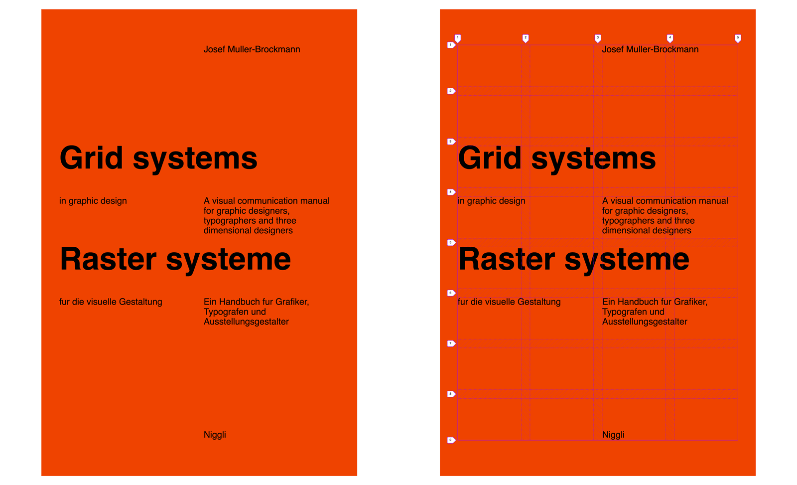
To get thinking about layouts in a Grid System way I turned to the best possible book to get started.
Include the image of the Grid Graphic Design Book.
This book by Josef Muller-Brokmann is the default reading for Graphic Design Students and remains the number one recommendation whenever I ask people where I should get more information about Grid layouts.
Inside the book are tonnes of pages of examples of Grid based layout that you can choose from. A really great source of inspiration when you’re trying out the Grid Layout. These pages in particular were of interest to me because it showed a number of different possibilities for laying out a grid. I took what I thought would be my most challenging to start with....Which of course was the very simplest example on the pages. But simple is where we want to start when learning something new, and from that base we can extend our capabilities.
So here’s a straight forward 4 x 8 grid. Let’s look at how we can lay this out using CSS Grid Layout.
Include Codepen of 4x8 column grid
.container {
    display: grid;
    grid-template-columns: 1fr 1fr 1fr 1fr;
    grid-template-rows: 100px 100px 100px
    100px 100px 100px 100px 100px;
    grid-gap: 10px;
}
A .container which I’ve literally named container. This is the parent. We apply the grid to the parent which affects all direct children.
Then we use grid-template-columns: to define how many columns and how wide we want them.(fr is a new unit, it equates to 1 fraction of the screen width... so four columns that take up 1 fraction of the width)
Then we use grid-template-rows: to define how many rows and how tall we want them. I’ve put 100px eight times to get 8 * 100px rows (here I’ve put in pixels). grid-gap is used to, and some of you may have
already guessed, gives us the gap between the grid items.
Now this is a little verbose, there’s a lot of repeated items there, so we can do this....
.container {
    display: grid;
    grid-template-columns: repeat(4, 1fr);
    grid-template-rows: repeat(8, 100px);
    grid-gap: 10px;
}
We can use repeat which is followed by the number of times you want to repeat it, and then the value you want repeated. This is great because it makes it easier to write AND easier for someone to look at and understand.
You might have noticed the numbers appear here as well. These are gridlines. When defining a grid we define the columns and rows, but a grid item is made up from a grid-column-start and grid-column-end line,
and a grid-row-start and grid-row-end line.
grid-column-gap: 10px;
grid-row-gap: 1em;
grid-gap: 1%;
grid-gap: 10px 1em;
You can set the grid-row-column and grid-row-gap individually, you can set it as a single value that applies to everything, or you can set two values on ‘grid-gap’ for column and then row.
As you can see from the markup here you can apply any value to the gap, and even mix the values as well. This is true for all size values in CSS Grid Layout, you can have a mixture as we’ll see in later examples.
You should note that although you can see the gridlines here in red, it’s not possible to style gridlines. If you set a background-color to the container and occupy all of the grid spaces then you will be left with the gaps as you can see here.
<div class=“a-grid-cell”></div>.a-grid—cell {
background-color: red;
grid-column: 3 / 4;
grid-row: 3 / 4;
}In these examples we have the HTML at the top and the CSS at the bottom. The grid-column starts at grid column line 3 and goes to line 4. The grid-row starts at grid row line 3 and goes to grid line 4.
<div class=“a-grid—row”></div>.a-grid-row {
background-color: red;
grid-column: 1 / 5;
grid-column: 1 / span 4;
grid-column: 1 / -1;
grid-row: 2 / 3;
}Here we want this <div> to occupy an entire row, i.e. span across all of the columns.
I’ve included the different ways you can accomplish this as well. With all great things on the web we offer several solutions to the same problem just to keep everyone guessing.
1 / 5starts and grid line one and goes to grid line 5.1 / span 4starts at grid line 1 and spans 4 lines (which actually works out to be the number of columns you want to span, I like this one but it can be a little harder to think about what it’s doing).1 / -1starts a grid line 1 and continues along until the end (or until it reaches another element placed on that row).- Finally, we say which row it is occupying.
<div class=“a-grid—col”></div>.a-grid-col {
background-color: red;
grid-column: 2 / 3;
grid-row: 1 / 9;
grid-row: 1 / span 8;
grid-row: 1 / -1;
}This is the same as the previous example, except across the other axis. grid-column is specifying that it will go from 2 / 3, however if I just left 2 there it would still do the same thing because by default
the item will span a single grid track in either direction.
<div class=“a-grid—area”></div>.a-grid-area {
background-color: red;
grid-column: 2 / 4;
grid-row: 1 / 4;
}You can also span multiple grid-columns and grid-rows.
You can overlap items and do a whole bunch more that I won’t have time to delve into today. I have said grid-area here as a way of describing a larger space, but there is also grid-template-areas that allow you to set up named regions on your layout. Lets look at an example.
Lets create a new grid layout, something a little more complex. Here i’m setting the .container to display: grid;, and setting up some rows to be 1fr, auto, 4em and 1fr,
and then some columns to be up some rows to be 6em, 1fr, 3fr.
Note that you can have different values? Grid accepts FR, VW, VH, PX, EM, REM, and auto.
This is what they look like when you see them together.

Grid Template Areas
So now we can assign names to each of these areas, or a group of these areas. To do this we include grid-template-areas and define each of them by naming them in the CSS.
Here we’ve got a grid of 3 x 4, so we need to name three across and four down. We say we want
- logo in the first column on the first row
- nav to then go across the next two columns on the first row
- side should occupy the first two columns AND the first two rows
- article should occupy the third column in the second row
- social should go in the third column of the third row
- footer should span across the entire grid container
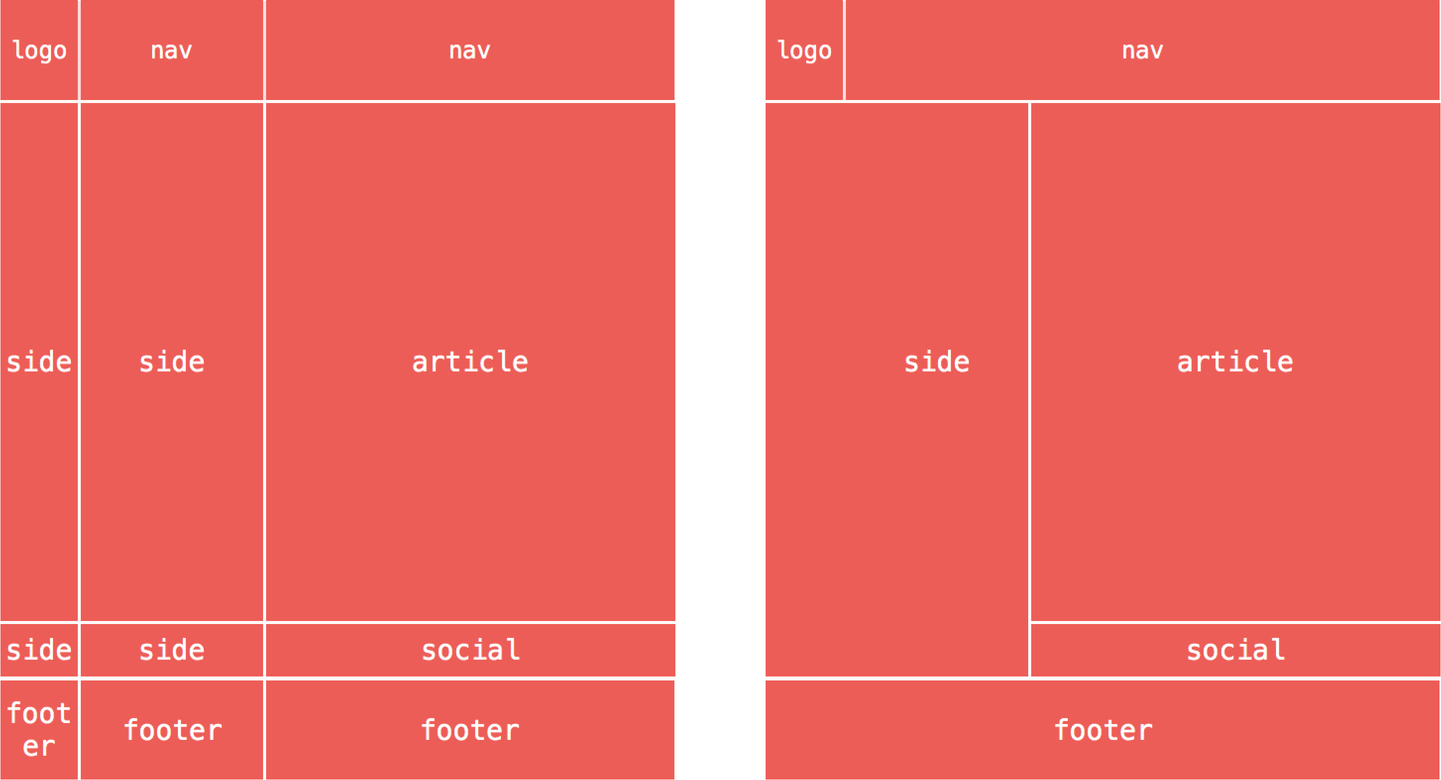
Now for each of the bits of content on the site we can easily place them in their spot by using the grid-area: name
.logo { grid-area: logo;}

.nav { grid-area: nav;}

.aside { grid-area: side;}

.article { grid-area: article;}

.social { grid-area: social;}

.footer { grid-area: footer;}
How would this look as a mobile first site though? At the moment we've only declared the larger viewport screens.
For this we want to start with a a tube of content stacked for the mobile view, and then at 500px we want to move the navigation into the top row next to the logo, and finally after 800px we want to have everything the way we have it above.
.container {
        display: grid;
        grid-template-columns: 6em 1fr 3fr;
        grid-template-rows: auto;
        grid-template-areas:
            "logo logo logo"
            "article article article"
            "side side side"
            "nav nav nav"
            "social social social"
            "footer footer footer";
    }

    @media (min-width: 500px) {
        .container {
                grid-template-areas:
                "logo nav nav"
                "article article article"
                "side side side"
                "social social social"
                "footer footer footer";
                }
        }

    @media (min-width: 800px) {
        .container {
            grid-template-rows: 1fr auto 4em 1fr;
            grid-template-areas:
                "logo nav nav"
                "side side article"
                "side side social"
            "footer footer footer";
                }
        }
Below is the codepen example, but here's a couple of things to point out.
- This makes source order insignificant for layout. Because we are explicitly placing the content items onto the grid the HTML can be in any order you want, as long as it is a direct child of the grid container. So you could have I would suggest this is better for SEO to get your main content higher up the page.
- You are not able to transition between grid positions. This SUCKS. The positive is that it’s just you and I who sit dragging our browser windows in and out, but still....it would be a nice to have feature. There is an example of the grid transition that Vincent Riermer has put together.
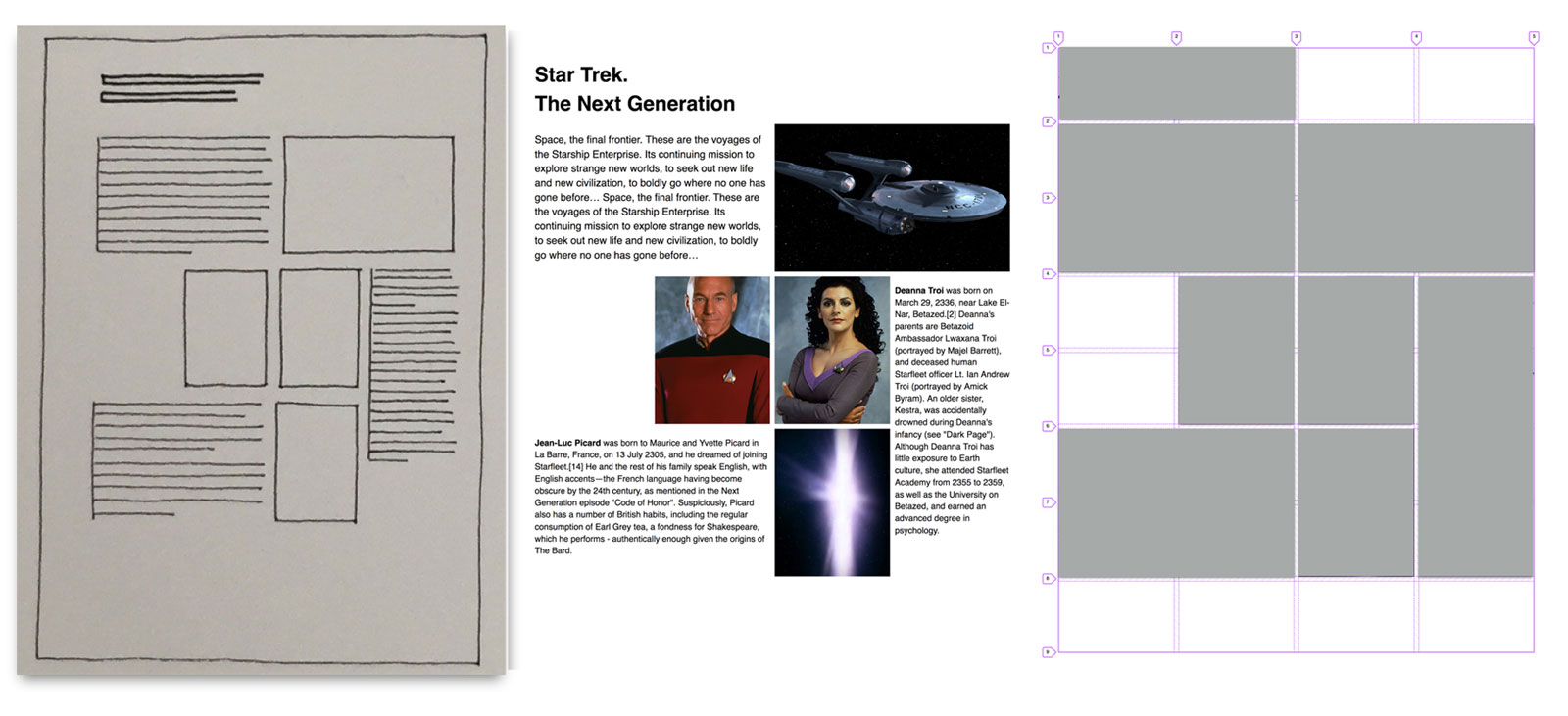
Grid examples from Grid Systems in Graphic Design
So if we go back to the Grid Systems book once again we can start looking through at different examples that we can try and create based on that 4 x 8 grid. In fact, if you look at the cover of the book itself....It is a 4 x 8 grid as well. This isn’t the grid actually, but instead a code pen layout that I created when learning about how to use Grid Layout options.
See the Pen Grid Systems in Graphic Design fluid type 01 by Justin Avery (@justincavery) on CodePen.
4x8 Grid Plain
See the Pen Sketches for a Grid with 32 fields 01 by Justin Avery (@justincavery) on CodePen.
4x8 Grid - Sidebar Images
This one has some images down the left and side and the content on the right.
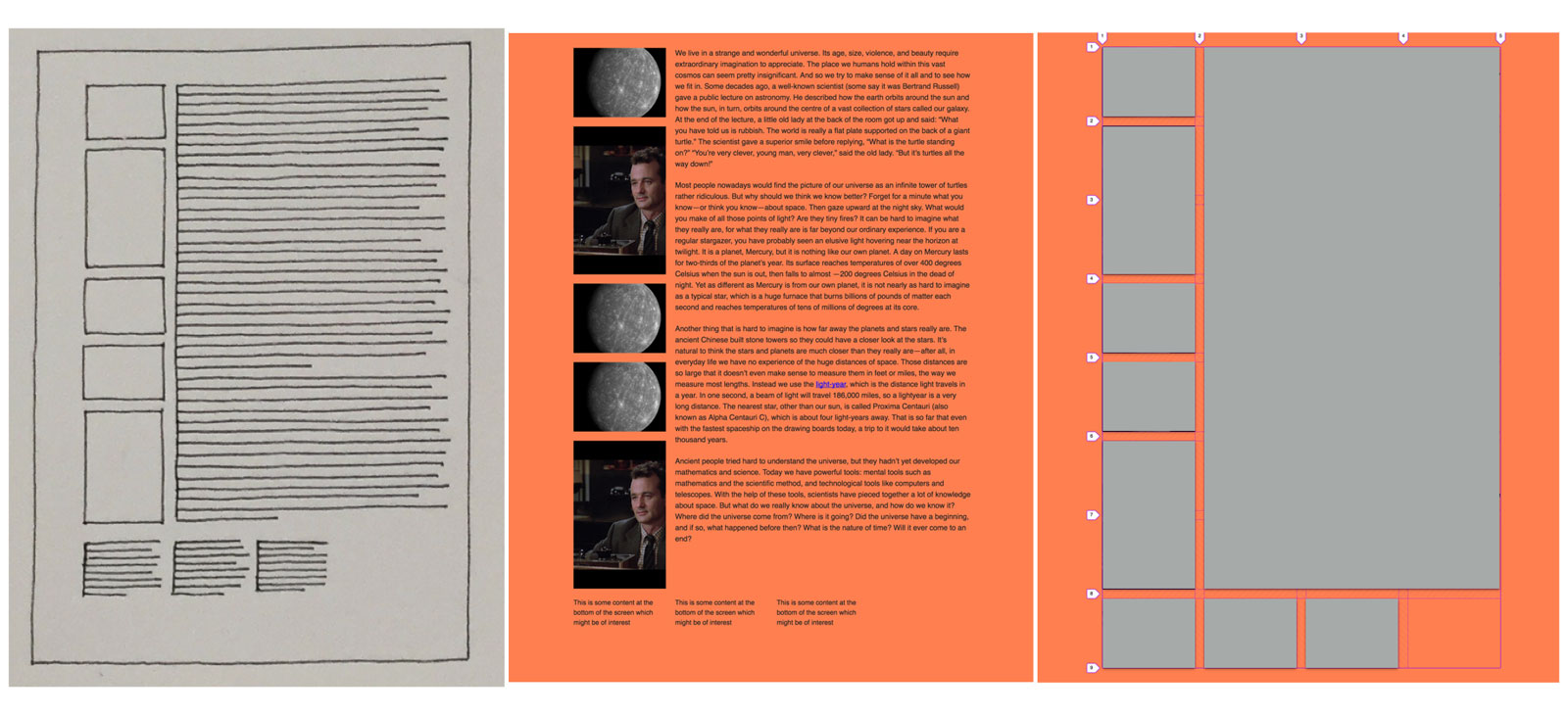
4x8 Grid - Image Gallery
This is more of a Photo Grid layout.

See the Pen Sketches for a Grid with 32 fields 03 by Justin Avery (@justincavery) on CodePen.
4x8 Grid - Magazine Style Layout
This is probably the most interesting of the examples.
You can see how many different kinds of layouts that we can start to achieve with something as simple as a 4x8 grid that took us a few lines to create.
See the Pen Sketches for a Grid with 32 fields 06 by Justin Avery (@justincavery) on CodePen.
4x8 Grid - Sidebar Images
Faster Websites
None of us set out to build slow websites, but what is the impact of building a slow website? Or better yet, what is the impact on our customers when we make our current website faster?
Amazon sees a 1% decrease in revenue for every 100ms increase in load time. http://radar.oreilly.com/2008/08/radar-theme-web-ops.html
You might look at that and think that 100ms isn't a lot of time, and that 1% isn't that much of an impact. When you take into consideration that Amazons Daily Revenue is $93,709,589.04, then you can calculate that for every 100ms delay it costs them $937,095.89
Netflix saw a 43% decrease in their bandwidth bill after turning on GZip. http://cdn.oreillystatic.com/en/assets/1/event/7/Improving%20Netflix%20Performance%20Presentation.pdf
If you consider that for every hour of Netflix you watch on standard definition you consume around 1 Gigabyte of data, and up to 3 Gigabytes of data on HD video, that's a hell-of-a-lot-a bandwidth saved.
The Trainline, a UK based company, reduced latency by 0.3 seconds across their funnel and customers spent an extra £8 million (~$11.5 million) a year. https://youtu.be/ai-6qwT6ES8?t=462
Tests of the new, faster FT.com showed users were up to 30% more engaged—meaning more visits and more content being consumed. https://www.wsj.com/articles/financial-times-hopes-speedy-new-website-will-boost-subscribers-1475553602
Rebuilding Pinterest pages for performance resulted in a 40% decrease in wait time, a 15% increase in SEO traffic and a 15% increase in conversion rate to signup. https://wpostats.com/2017/03/10/pinterest-seo.html
All of those stats come from WPO stats. You can get a tonne of different statistics that will help back up your business case about why you need to spend time and effort making your site more performant. Each statistic is linked to research or an article backing the claim as well.
The statistics are categorised into the following:
- Ads
- Revenue
- Expenses
- Traffic
- Bounces
- 2006-2017
- Ads
aside from these reasons there’s also another reason to build faster sites.
The Next Billion Users
At this conference a year ago Ethan Marcotte stood on stage and talked to you about creating sites for the next billion users.
Last year one of the creative speakers that talk on the Thursday morning was Zach Posen and he talked about reaching billions of people around the world with his designs.
Well, you have that capability. As content editors, web designers, art directors, web developers, product owners.... as people(individuals and teams) who craft web experiences, you all have the power to reach billions of people with your work.
Last was an amazing milestone upon which we finally tipped the balance to have more of the worlds population with access to the internet than not. 50.1% of the worlds population had access in 2016. This year, in 2017, This year we’ve increased by another 1.6% to 51.7%, which has added a more than 200 million people that we can reach. These statistics are available from www.internetworldstats.com
Our Users. Our Target Market
We talk a lot about “our” users and “our” target market, but when you look at it from a global stand point the number of people that we can reach across the UK, Australia or the US are dwarfed in comparison with the number of users that are accessing our sites across the rest of the world.
I've been in meetings where I've pushed back on adding an autoplay video to the homepage, or having 10-15 fonts loading on a page to get a particular desin effect (which wasn't core to the experience). In one particular meeting the "Project Owner" turned to me to say that their target market "... was people with broadband internet connections and the latest and greatest devices".
Let me be clear: This is a terrible approach to building a website.
This is one of my favourite maps. If you haven’t seen it before it shows a white circle, and there are more people living within that circle than are living outside of it. These are the next billion people that will be using the web and accessing the websites that we craft for them today.
If we look at Africa and Asia and the number of current internet users it makes up almost 60% of all users on the internet. If you think what we would consider to be “our” target market in our respective countries.... the combination of the USA and Australia don’t even reach 9%.
If you look at how many people are coming online.... Between Africa and Asia they make up more than 71% of the worlds population. This is where the next billion will be coming from. And the next billion users have completely different challenges from us.
Speaking broadly here, when most of us in the room access the internet on our phones we do it out of convenience.
Emerging markets use mobile phones to access the web out of necessity.
Power is massive problem for emerging markets. There are many charging stations like this one, ones plugged into generators, and a number of solar powered stations.
They also have the same issue around the cost of access to the web. They’re not on Gigabyte plans, but megabyte plans and it can be incredibly expensive.
In fact, if we ignore emerging markets for a second, there are a large number of US and UK families who’s only access to the web is via mobile devices as well, and they share the issue that the cost for data can be expensive.
If I go back to ‘our’.
- Disney want to sell products.
- Universities want to generate student fees.
But in saying that I believe that...
- Disney also wants to make children happy.
- Universities want to make the world a more educated place.
One of my all time favourite websites in the entire world was the MIT Open Courseware site.
MIT Open Courseware makes the materials used in the teaching of almost all of MIT's subjects available on the Web, free of charge. With more than 2,400 courses available, OCW is delivering on the promise of open sharing of knowledge.
You can go and visit the site and take any course that you might learn more about. You get the full course details, audio recordings of all the lectures and video lectures whereever possible. All of the assignments, exams and test are all there freely available. The only thing you don't get is help from the faculty, a grade, or a certificate when you finish. But, you get the most important thing.... knowledge.
If we build fast performant sites not only do we cater for the next billion users, but if we go back to ‘OUR’ target market then they have far better experiences and from WPO Stats we can see how that translates to improved engagement.